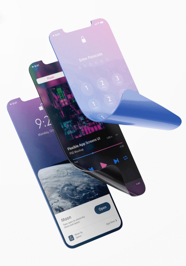
Table of Contents
The Foldable Revolution: Why Your Next Mobile App Must Be Optimized for Foldable Devices
Picture this: you’re trying to compare notes for a meeting while simultaneously drafting an email on your phone. You’re pinching, zooming, and frantically switching between apps. The screen feels cramped, your workflow is clunky, and a simple task suddenly feels like a digital juggling act.
We’ve all been there. For years, we’ve accepted the limitations of a single, static smartphone screen. But what if that screen could fluidly expand, giving you the space of a tablet when you need it and the portability of a phone when you don’t?
Welcome to the foldable revolution.
Led by innovators like Samsung, Google, and Motorola, foldable devices are rapidly moving from a niche novelty to a mainstream powerhouse . The foldable smartphone market, valued in the billions, is projected to see explosive growth, with shipment estimates reaching over 55 million units by 2025 . This isn’t just a passing fad; it’s the next evolution in mobile technology.
Your customers are embracing this new form factor for its promise of enhanced productivity and immersive experiences. The real question is: is your mobile app ready to meet their expectations?
The Jarring Experience of an Unoptimized App
Before we dive into the solution, let’s talk about the problem. When a user opens a non-optimized app on their shiny new foldable device, the experience is often frustrating, if not completely broken.
It looks something like this:
- Wasted Space: The app is stuck in the middle of the large, unfolded screen, with huge black bars on either side.
- Stretched or Broken Layouts: Images are distorted, text overlaps, and buttons are pushed into awkward, unusable positions.
- App Crashes: The app simply gives up and closes when the user folds or unfolds the screen.
This isn’t just a minor glitch; it’s a direct message to your user that your brand isn’t keeping up. In a competitive market, a poor user experience is a one-way ticket to the uninstall button.
How We Build Apps for the Foldable Future
Optimizing an app for a foldable device is about more than just making it bigger. It’s about creating an intelligent, adaptive experience that harnesses the unique capabilities of the hardware. It’s about making the technology feel like magic. Here’s how we do it.
1. Seamless App Continuity: The Core Principle
The most critical feature of a foldable-optimized app is app continuity. This means the app must transition fluidly between the small, folded screen and the large, unfolded one without missing a beat .
Imagine a user is viewing a product on your e-commerce app on the front screen. When they unfold the device for a better look, the app should instantly and seamlessly switch to an expanded view showing more details, customer reviews, and larger images-without reloading or losing its place. This seamless flow is the foundation of a great foldable experience.
2. True Multitasking with Multi-Window Support
Foldable phones are multitasking beasts. Their large screens are designed to have multiple apps running side-by-side, and your app needs to be a good neighbor . We ensure our apps function flawlessly in split-screen mode, allowing users to do things like:
- Drag and drop a file from a cloud storage app directly into an email.
- Watch a video tutorial on one half of the screen while taking notes on the other.
- Compare two products from your catalog side-by-side.
By supporting these intuitive workflows, you transform your app from a simple tool into a productivity powerhouse.
3. Adaptive UI: Beyond Basic Responsive Design
Traditional responsive design is about adapting to different screen sizes. Foldable optimization is about adapting to different screen states and postures . It requires a more sophisticated approach where the user interface doesn’t just scale up, but intelligently reconfigures itself.
- For a news app: The folded view might show headlines, while the unfolded view presents a multi-column, magazine-style layout.
- For a messaging app: The folded view could show your chat list, while the unfolded view displays the chat list on one side and an open conversation on the other .
This intelligent use of space makes the app feel like it was custom-built for the device, delivering a truly premium experience.
The Business Case: Why This Is a Smart Investment, Not an Expense
Thinking this is a “nice-to-have” for the future? Think again. Optimizing your app for foldable devices now offers a tangible competitive advantage.
- Capture the Early Adopter Market: The foldable market is growing fast, but the number of fully optimized apps is still relatively small. This is your chance to stand out and capture a valuable audience of tech-savvy early adopters who appreciate high-quality experiences .
- Boost User Engagement and Retention: An app that provides a superior, immersive, and productive experience on a foldable device will naturally command more of the user’s time and loyalty. Increased engagement is a direct path to higher retention .
- Signal Innovation and a Premium Brand: Having an app that works flawlessly on the latest technology sends a powerful message. It shows that your brand is forward-thinking, invested in customer experience, and at the forefront of innovation.
Is Your App Ready for the Unfolding Future?
The foldable revolution is here, and it’s changing user expectations for what a mobile app can and should do. Sticking with a static, one-size-fits-all design is no longer a viable option for businesses that want to lead.
The goal is to create an experience so intuitive that the user doesn’t even notice the technology-they only feel the power and convenience it provides. By embracing app continuity, multitasking, and truly adaptive design, you can ensure your app doesn’t just work on a foldable device, but shines.
Ready to offer your users an experience that is as flexible and dynamic as the new devices in their hands? Schedule a free consultation with our team, and let’s build an app that’s ready for the foldable future.
Frequently Asked Questions (FAQs)
No, you don’t. The best approach is to optimize your existing application. Using modern development frameworks and tools like Jetpack WindowManager, we can make your single codebase adapt intelligently to both standard and foldable devices.
Not anymore. While it started with major brands, the development tools and best practices have become more accessible. A strategic investment in optimizing key user flows can deliver a significant ROI for businesses of all sizes by improving engagement and reducing user churn.
Standard responsive design adapts layouts to different screen sizes and orientations (portrait vs. landscape). Foldable optimization is more advanced; it adapts the UI to different device postures (e.g., folded, unfolded, and partially folded tabletop mode), and it requires seamless state management during these transitions .
A rigorous testing strategy is crucial. We use a combination of specialized emulators provided by manufacturers like Samsung and Google, as well as testing on a range of physical foldable devices to ensure a flawless and consistent user experience across the board.