
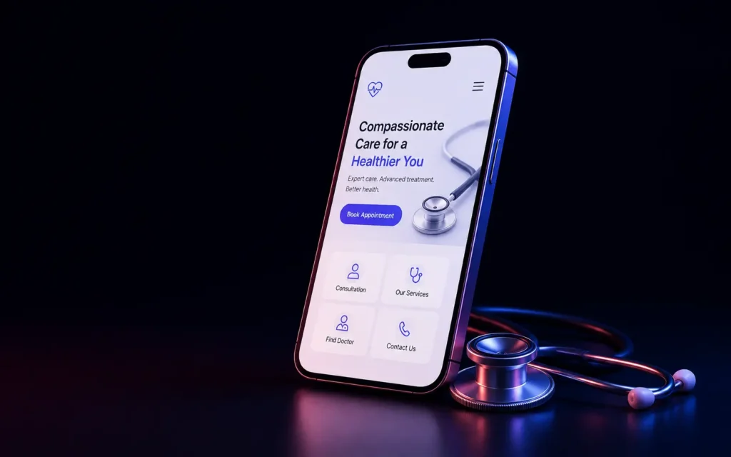
Most doctor and clinic websites we audit were built for desktop viewing first, sometimes years ago, in an era when that was a reasonable assumption. It isn’t anymore - the overwhelming majority of patients searching for a doctor or clinic today are doing it on a phone, often urgently, often while dealing with a real health concern, and a website that doesn’t respect that context is losing patients before they ever pick up the phone to book.
Why mobile design matters more, not just equally, for healthcare specifically
A patient searching for a doctor is frequently doing so under real time pressure or genuine anxiety - a symptom that’s worrying them, a need to book an appointment soon, sometimes searching for urgent care on the go. This context matters for design decisions in a way it doesn’t for a more relaxed browsing scenario: every extra tap, every unclear piece of information, every slow-loading page is friction a stressed or urgent searcher has less patience for than a casual browser would.
What actually matters for a doctor or clinic’s mobile experience
- Click-to-call as the single most important call to action, prominently placed and always accessible - not buried in a contact page, but available from every page, because a patient ready to book often wants to call immediately, not navigate through a multi-step web form.
- Genuinely fast load times, particularly for patients on mobile data rather than wifi - a slow-loading clinic website, at the exact moment someone urgently needs information, reads as unreliable in a way that directly undermines trust in the practice itself.
- Clear, scannable information hierarchy - services offered, insurance accepted, location and hours immediately visible without hunting, because a stressed searcher doesn’t have patience to dig for basic practical information.
- Simple, low-friction appointment booking - a booking flow that works reliably on a small screen with a real keyboard, not a form designed and tested primarily on desktop that becomes awkward or broken on mobile.
Where trust signals matter differently in healthcare
Beyond general trust-building principles we’ve covered elsewhere, healthcare-specific trust signals matter disproportionately - visible credentials, genuine patient testimonials (handled carefully within healthcare privacy and advertising regulations), and clear, honest information about a doctor’s actual experience and specialization. A patient making a healthcare decision is evaluating trust more carefully than a typical e-commerce purchase decision, and the mobile experience needs to convey that trust quickly, not just eventually.
What we’ve seen actually move real booking numbers
Simplifying the path from “found the site” to “booked or called” is consistently the highest-leverage change we make for healthcare clients - removing unnecessary steps, making the call-to-action genuinely prominent rather than one option among many, and making sure the mobile experience loads fast and doesn’t require zooming or awkward navigation to find basic information. This is less about visual redesign and more about genuinely removing friction from a path that matters more than most other business contexts, given the urgency many patients are searching under.
What we’d actually recommend
Test your own site’s mobile experience honestly, on an actual phone, under a simulated “I need to find and book an appointment quickly” scenario - most practices haven’t done this test on their own site and are surprised by the friction a real patient would encounter.
We build mobile-first healthcare websites as part of our healthcare technology work. Get in touch if you want an honest audit of your practice’s mobile booking experience.