
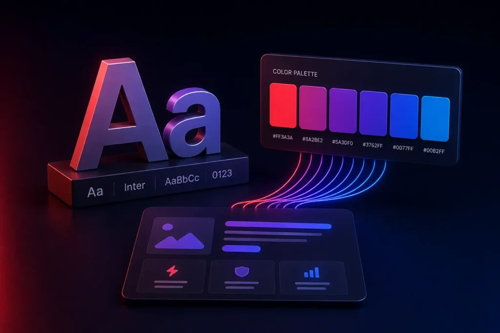
“Make it pop” is the design brief every engineer building a color picker or a typography scale dreads, because it’s a feeling, not a specification. The part that gets lost in that framing: typography and color aren’t decoration layered on top of a UX decision, they’re doing real, measurable UX work - legibility, hierarchy, trust, emotional tone - whether or not anyone treats them that deliberately.
What typography is actually doing, beyond looking good
Typography’s real job is guiding a reader’s eye through information in the order that matters, at the speed they can actually process it. A well-built type scale (a deliberate, limited set of sizes and weights, not an ad-hoc mix chosen per-screen) creates visual hierarchy that lets users scan and understand a page’s structure almost instantly - what’s the headline, what’s supporting detail, what’s an action - without consciously reading every word. A poorly considered type scale, even with a “nice” font, forces users to work harder to parse the same information, which shows up as measurable friction: higher bounce rates, lower comprehension, more support questions about things that were actually explained on the page, just not legibly.
Where we’ve seen typography choices actually cost real conversion
Body text set too small, or with too little line height, measurably increases reading fatigue and drop-off on longer content - a specific, testable UX cost, not an aesthetic nitpick. Too many font weights or sizes used inconsistently across a product breaks the visual hierarchy that’s supposed to help users scan, forcing them to actually read everything to figure out what matters. And a mismatch between a brand’s typography and its actual audience - an overly playful, rounded typeface on a fintech product handling people’s money, for instance - creates a subtle trust mismatch users feel even if they couldn’t articulate why.
What color is actually doing, beyond brand identity
Color’s practical UX job is directing attention and communicating state - what’s clickable, what’s an error, what’s success, what’s disabled - consistently enough that users learn the pattern once and can rely on it everywhere in the product. A color system with genuine, consistent meaning (this specific shade always means “destructive action,” this one always means “success”) lets users act confidently without re-reading every button’s label. A color system used inconsistently - where the same red sometimes means “delete” and sometimes is just a brand accent - actively erodes that trust and forces users to slow down and double-check actions they should be able to take confidently.
The part most teams get backwards
Color and typography choices are usually made from a mood board first, then reality-checked against accessibility and usability requirements afterward, if at all. We build it the other way: establish the functional requirements first - contrast ratios that meet accessibility standards, a type scale that actually creates clear hierarchy, a color system with consistent, learnable meaning - and then find the specific palette and typeface that satisfies those requirements while also matching brand personality. Both goals are achievable together; the order you solve them in determines whether you end up retrofitting accessibility onto a palette that fights it, or building on a foundation that already accounts for it.
What we actually deliver
A type scale and color system defined once, with explicit rules for what each element means and where it’s used, built into the actual component library - not a moodboard that gets reinterpreted differently by every designer and engineer who touches the product afterward. This consistency is what makes a design system actually function as a system, rather than a loosely related set of individually pretty screens.
We build this as a core part of every design system we create. If your product’s visual identity feels inconsistent screen to screen, or you’re not sure your current palette actually meets accessibility requirements, get in touch for an honest audit.