
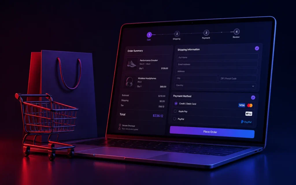
Checkout is the one page on a commerce site where every extra step, every unnecessary redirect, every moment of “is this still loading” directly costs money. We’ve audited enough checkout flows to know the pattern by now: most abandoned carts aren’t about price, they’re about friction accumulated across a checkout process nobody stress-tested end to end. Single-page checkout architecture, done properly on a platform like commercetools, is one of the highest-ROI changes we make on enterprise commerce projects.
Why multi-page checkout is still the default, and why it’s a problem
Traditional checkout flows - cart, then shipping, then payment, then review, each a separate page load - exist partly for historical reasons (simpler to build, simpler to reason about state) and partly because breaking checkout into steps feels more manageable to build and test. The cost is real: every page transition is a moment where a slow network, a confusing back button, or simple impatience can lose the customer, and each of those transitions compounds against the previous one, and against whatever anxiety already exists around entering payment details.
What single-page checkout architecture actually requires
Moving to a genuinely single-page checkout isn’t just a visual redesign - it requires real architectural changes to how state and validation are handled:
- Client-side state management for the entire checkout flow, so shipping info, payment details, and order review all live in one coherent state object rather than being handed off between separate page loads - this is what makes the “single page” feel actually seamless rather than a series of hidden page transitions dressed up to look continuous.
- Real-time, field-level validation rather than validation only on final submit - catching an invalid pincode or a card number issue the moment it’s entered, not after the customer has filled out the entire form and hit submit.
- Optimistic UI for every interaction - applying a discount code, selecting a shipping method, updating quantity - updating the total and the interface immediately, with the actual API call and validation happening in the background, so nothing in the checkout flow feels like it’s waiting on a network round-trip.
- Robust error recovery that doesn’t lose entered data. If a payment fails or a shipping method becomes unavailable mid-checkout, the customer should never have to re-enter information they already provided - this single failure mode is responsible for a disproportionate share of checkout abandonment when it happens.
Where commercetools specifically fits this
Commercetools’ API-first, headless architecture is well-suited to building genuinely custom checkout experiences, because it doesn’t impose a specific checkout UI the way some platforms do - the commerce logic (cart, pricing, promotions, order creation) lives behind an API your frontend calls directly, which means the checkout UI can be built exactly to the single-page, state-managed pattern described above, without fighting a platform’s built-in checkout flow assumptions.
What we’ve measured from doing this
On enterprise commercetools implementations where we’ve rebuilt checkout as a genuine single-page flow with real-time validation and optimistic updates, the consistent pattern is a meaningful reduction in checkout abandonment - usually most visible on mobile, where the cost of extra page loads and re-entering data is felt most acutely. The exact numbers vary by client and traffic mix, but the direction is consistent enough that we now treat single-page checkout as close to a default recommendation for any enterprise commerce rebuild, not an optional enhancement.
We build this as part of our enterprise commerce work. If your checkout is still a multi-page flow and you haven’t measured where customers are actually dropping off, get in touch - that’s usually the first thing worth auditing before a broader platform decision.