
Mobile-First Design Principles for 2026
What is mobile-first design?
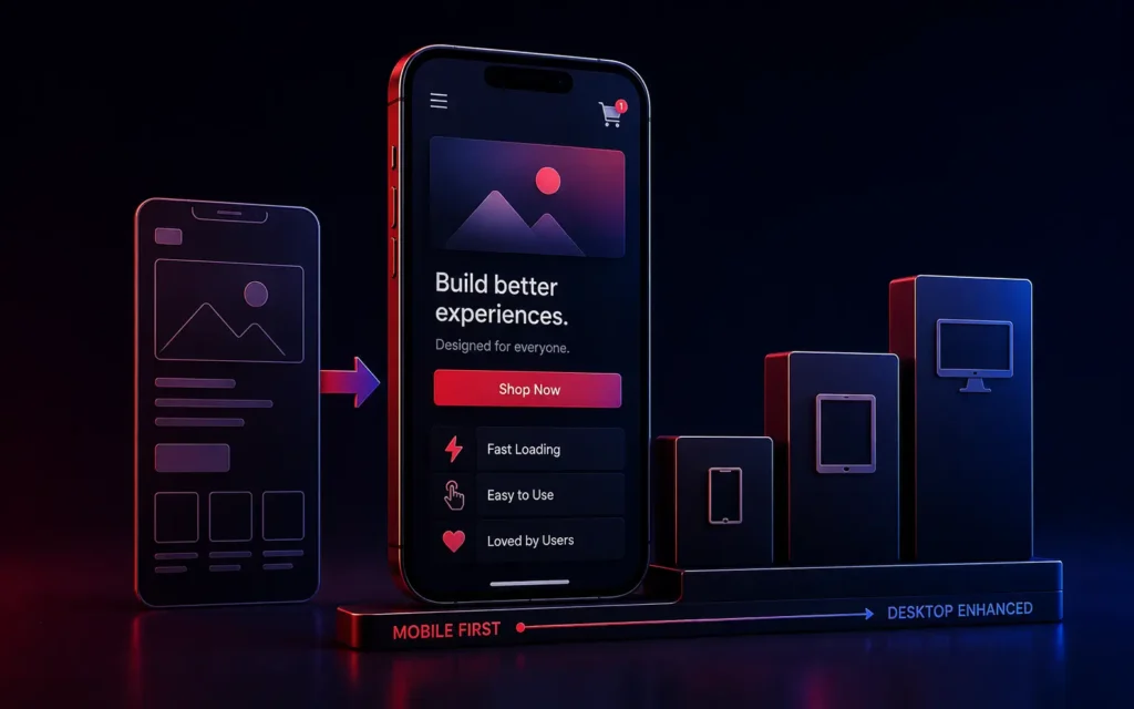
Mobile-first design is a product strategy where a website or application is sketched, prototyped, and coded for smartphone screens first, before being scaled up to fit larger desktop monitors. It forces designers to ruthlessly prioritize core content and critical features, as mobile screens lack the space for unnecessary clutter.
For Web Designers and Product Owners, clinging to the desktop-first workflow is the fastest way to ruin a digital product.
Historically, agencies would design a massive, sprawling website on a 27-inch monitor. Once the client approved it, the developers would try to “squish” that massive design down to fit on an iPhone. The result was always a cluttered, slow, and frustrating mobile experience.
In 2026, over 60% of global web traffic-and the vast majority of E-Commerce purchases-occur on mobile devices. Google operates strictly on Mobile-First Indexing (meaning your desktop site literally does not exist in the eyes of the search engine).
If you are beginning a new Custom Web Development project, the desktop layout is entirely secondary. Here are the core mobile-first design principles that dictate modern UX architecture.
1. Content Prioritization (The Constraint of Space)
The greatest benefit of mobile-first design is physical restriction. A smartphone screen is small. You cannot fit three sidebars, massive background videos, and a complex mega-menu on the screen simultaneously.
Mobile-first forces ruthless prioritization. You must ask: What is the single most important action the user needs to take on this specific page?
If you are designing a SaaS pricing page, the mobile screen only has room for the core features and the “Start Free Trial” button. All secondary information (like the deep dive into API Integrations) must be hidden behind expandable accordions. By designing for the smallest screen first, you guarantee the user is presented only with what truly matters, creating a highly focused conversion funnel.
2. Design for “The Thumb Zone”
Desktop users navigate with the precision of a mouse pointer. Mobile users navigate with a blunt instrument: their thumb.
Mobile-first UI must be built around “The Thumb Zone”-the area of a phone screen that a user can easily reach while holding the device with one hand.
- The Bottom is Premium: Critical navigation menus, primary Call-to-Action (CTA) buttons, and search bars should be anchored to the bottom of the screen, not the top.
- Target Size Matters: A text link that is easy to click with a mouse is impossible to tap with a thumb without accidentally hitting the link next to it. Mobile buttons must be massive (Apple recommends a minimum touch target of 44×44 pixels) with ample padding between interactive elements.
3. Speed is a UI Component
On a desktop connected to fiber-optic Wi-Fi, heavy Javascript and uncompressed images might load instantly. On a mobile device relying on a fluctuating 5G connection, that same code will cause a 10-second load delay.
As we discussed in our guide to Core Web Vitals, speed is fundamentally a user experience metric. Mobile-first design requires developers to build the lightest possible architecture first. This means avoiding massive hero videos, deferring non-essential scripts, and utilizing CSS animations rather than heavy JavaScript libraries.
4. Typography Hierarchy and Contrast
Reading long-form content on a glaring, smudged smartphone screen while standing in sunlight is difficult.
Mobile typography must be flawless. You cannot use 12pt light-grey fonts. Mobile-first design requires stark contrast (see The Psychology of Color in UI Design) and highly legible, sans-serif fonts scaled specifically for readability. Heading structures must be extremely clear so the user can rapidly scroll and scan the content with their thumb to find exactly what they need.
Conclusion
Mobile-first design is not a trend; it is the permanent reality of the market. It is a philosophy of reduction, clarity, and performance. By starting with the smallest, most restrictive canvas, you build an inherently focused and blazing-fast core product. When that solid mobile foundation is eventually scaled up to desktop, the resulting application is universally clean, highly converting, and fully aligned with modern search engine requirements.
Are your mobile conversion rates lagging behind your desktop?
At VDPL, we architect all enterprise web platforms and custom software using strict mobile-first methodologies to ensure peak performance on every device. Contact us today to review your mobile architecture.
Frequently Asked Questions (People Also Ask)
What is the difference between responsive design and mobile-first design?
Responsive design is a technical method where a website automatically fluidly scales and adjusts its layout to fit whatever screen size the user is on (desktop, tablet, or phone). Mobile-first design is a strategy and workflow. It means you conceptualize, design, and write the code for the mobile layout before you even begin thinking about the desktop version.
Why did Google switch to mobile-first indexing?
Google switched to mobile-first indexing because the majority of all internet searches are now performed on mobile devices. Historically, Google evaluated the desktop version of a site for ranking. However, this caused terrible user experiences when mobile searchers were sent to websites that looked great on desktop but were broken or unreadable on a phone.
How big should buttons be on mobile devices?
To ensure an accessible and frustration-free user experience, interactive elements (like buttons or links) should have a minimum touch target size of 44×44 CSS pixels (as recommended by Apple’s Human Interface Guidelines) or 48×48 pixels (as recommended by Google Material Design), with sufficient spacing between them to prevent accidental mis-taps.