
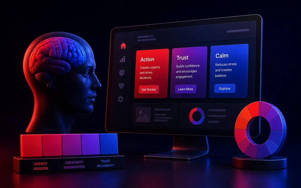
How does color psychology affect UI design?
Color psychology dictates how users subconsciously perceive and react to a digital interface. In UI design, color is used as a functional tool to establish brand trust, guide the user’s eye toward primary actions (like a checkout button), and evoke specific emotional responses that heavily influence conversion rates and user retention.
For Creative Directors and Product Managers, choosing a color palette for a new Custom Web Development project is rarely about what simply “looks nice.”
Human beings are hardwired to react emotionally to color. Before a user reads a single line of text on your website, their brain has already processed your color palette and made a subconscious judgment about your brand’s trustworthiness, price point, and industry.
If you design a banking app using a chaotic mix of neon orange and hot pink, users will instinctively feel the app is insecure and frivolous, regardless of how robust the underlying Cloud Architecture is. Understanding the psychology of color in UI design is the secret weapon for crafting high-converting digital experiences.
The Subconscious Meaning of Core UI Colors
While cultural context matters, certain colors have deeply ingrained psychological associations in modern digital design.
1. Blue: Trust, Security, and Corporate Stability
Blue is the undisputed king of enterprise UI design. It lowers heart rates and evokes feelings of deep trust, security, and calm. This is precisely why almost every major bank (Chase, Citi), social network (Facebook, LinkedIn), and enterprise SaaS platform utilizes a blue-dominant palette. If you are selling expensive B2B software, blue establishes immediate credibility.
2. Green: Success, Wealth, and Growth
Green is the easiest color for the human eye to process. It is universally associated with positivity, financial wealth, and environmental growth. In UI design, green is the default color for success states (e.g., “Payment Successful”). It is also heavily utilized by FinTech apps (Robinhood, Mint) to subliminally reinforce the concept of money and portfolio growth.
3. Red: Urgency, Passion, and Error
Red is a physiological trigger. It raises the heart rate and demands immediate attention. In UI design, red is a highly aggressive functional color. It must be used sparingly. It is almost exclusively reserved for destructive actions (e.g., “Delete Account”), error states (e.g., “Invalid Password”), or massive urgency indicators (e.g., a clearance sale banner in an E-Commerce Store).
4. Orange & Yellow: Energy, Affordability, and Action
These are high-energy, playful colors. Yellow grabs attention quickly but can cause eye strain if overused. Orange is frequently used for Call-to-Action (CTA) buttons because it stands out brilliantly against blue or white backgrounds. Both colors are often associated with affordability and youth, making them popular for budget airlines or fast-food delivery apps.
The Rule of 60-30-10 in UI Color Theory
When designing an interface, you cannot use colors equally. The most effective UI designs rely on the timeless interior design principle: the 60-30-10 Rule.
- 60% Primary Color: This is usually a neutral color (white, light gray, or deep navy for Dark Mode). It acts as the vast background canvas, providing breathing room and ensuring the text is readable.
- 30% Secondary Color: This is your core brand color (e.g., Enterprise Blue). It is used for headers, active navigation tabs, and secondary elements to establish the brand identity.
- 10% Accent Color: This is your highly contrasting, “action” color (e.g., Vibrant Orange). It is used only for primary Call-to-Action buttons (like “Sign Up” or “Checkout”). Because it is used so sparingly, the eye is immediately drawn to it.
Accessibility: The Ultimate Color Constraint
As we emphasize heavily in our UI/UX Trends analysis, color choices must be dictated by accessibility.
You cannot rely on color alone to convey critical information. Colorblind users may not be able to distinguish between a red “Error” box and a green “Success” box. Your foreground text and background color must pass strict WCAG contrast ratios. A beautiful light-grey text on a white background might look sleek to a designer, but if a visually impaired user cannot read it, the design is a failure.
Conclusion
Color is a silent language. By mastering the psychology of color and adhering to strict contrast and proportion rules, UI designers can actively manipulate user flow, instantly establish brand authority, and dramatically reduce friction at the point of conversion. In the digital world, color is never just decoration; it is highly strategic functional design.
Is your application’s design failing to convert users?
At VDPL, our elite UI/UX designers utilize data-driven color theory and thorough user testing to architect high-converting, accessible software interfaces. Contact us today to discuss a UX redesign.
Frequently Asked Questions (People Also Ask)
Why is blue so common in app design?
Blue is the most universally preferred color across all demographics. Psychologically, it evokes feelings of trust, security, reliability, and calm. For industries handling sensitive data-like banking, healthcare, or enterprise software-using blue helps subconsciously reassure the user that the platform is secure and professional.
What is the best color for a Call to Action (CTA) button?
There is no single “best” color, but the most effective color is the one that provides the highest contrast against the rest of your website’s color palette. If your website is mostly blue and white, a bright orange or warm red button will perform best because it immediately draws the eye through the psychological principle of isolation (the Von Restorff effect).
What is the 60-30-10 rule in UI design?
The 60-30-10 rule is a classic design principle used to create balanced, visually appealing color palettes. It suggests that a UI should be composed of 60% dominant base color (usually a neutral background), 30% secondary brand color (for headers and accents), and 10% highly contrasting accent color (reserved exclusively for CTA buttons and critical links).